Other Stuff

Sunday, November 29, 2015

More Than Average Confusion About What Mean Means Mean


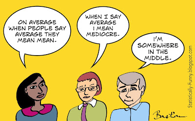
Cartoon about what people mean when they say average


She's right: on average, when people talk about "average" for a number, they mean the mean.

The mean is the number we're talking about when we "even out" a bunch of numbers into a single number: 2 + 3 + 4 equals 9. Divide that total by 3 - the number of numbers in that set - and you get the mean: 3.

But then you hear people make that joke about "almost half the people being below average" - and that's not the mean any more. That's a different average. It's the median - the number in the middle. It comes from the Latin word for "in the middle", just like the word medium. That's why we call the line that runs down the middle of a road the median strip, too.

If the numbers in a group are all pretty close to each other - like our example here, or, say, the ages of everyone in a class at school - then there's not much difference between the mean and median.

But if the numbers in a group are wildly far apart - the ages of the people who like Star Wars movies, for example, or whose favorite singer is Frank Sinatra - then it can make a very big difference. Even if Strangers In The Night had enough of a resurgence to drag the average age of Ol' Blue Eyes listeners down, the big Sinatra fan base would still skew older!

How far apart numbers in a dataset are spread from each other is called variance: if the numbers bunch up in the middle, the variance is small. And understanding or dealing with variance is where we start to head in the direction of, well, sort of means of means.

The distance of a piece of data from the group's mean is a great standard way to measure the spread. This is called the deviation from the mean. A measure called the standard deviation from the mean will be bigger when the numbers are more spread out. Lots of results will cluster within 1 standard deviation (SD), and most will be within 2 standard deviations. Roughly like this:


From here, it's a hop, skip to another calculation based on the mean that you often come across in health studies. It's a way to standardize the differences in means (average results) called the standardized mean difference (SMD).

The SMD needs to be used when outcomes have been measured in similar, but different, ways in groups that researchers are comparing.

There's a lot you can make sense of when you know what the means mean!


The SMD is calculated by dividing the differences in the mean in two groups by standard deviations. You can read more on standard deviations here at Statistically Funny.

Feel like testing your knowledge of the mean, median, and mode? (The mode is the number in a set that occurs the most often: so if our example had been 2 + 3 + 4 + 4, then the mode would have been 4.) Try the Khan Academy quiz.

Interested in the ancient roots of averages? Examples from Herodotus, Thucydides, and in Homer here (very academic).


Note: Edited to address broken links, on November 6, 2022.

Hilda Bastian

Wednesday, September 30, 2015

AGHAST! The Day the Trial Terminator Arrived


Clinical trials are complicated enough when everything goes pretty much as expected. When it doesn't, the dilemma of continuing or stopping can be excruciatingly difficult. Some of the greatest dramas in clinical research are going on behind the scenes around this. Even who gets to call the shot can be bitterly disputed.

A trial starts with a plan for how many people have to be recruited to get an answer to the study's questions. This is calculated based on what's known about the chances of benefits and harms, and how to measure them.

Often a lot is known about all of this. Take a trial of antibiotics, for example. How many people will end up with gastrointestinal upsets is fairly predictable. But often the picture is so sketchy it's not much more than a stab in the dark.

Not being sure of the answers to the study's questions is an ethical prerequisite for doing clinical trials. That's called equipoise. The term was coined by lawyer Charles Fried in his 1974 book, Medical Experimentation. He argued that the investigator should be uncertain if people were going to be randomized. In 1987, Benjamin Freedman argued the case for clinical equipoise: that we need professional uncertainty, not necessarily individual uncertainty.

It's hard enough to agree if there's uncertainty at any time! But the ground can shift gradually, or even dramatically, while a trial is chugging along.

I think it's helpful to think of this in 2 ways: a shift in knowledge caused by the experience in the trial, and external reasons.

Internal issues that can put the continuation of the trial in question include:
  • Not being able to recruit enough people to participate (by far the most common reason);
  • More serious and/or frequent harm than expected tips the balance;
  • Benefits much greater than expected;
  • The trial turns out to be futile: the differences in outcome between groups is so small, even if the trial runs its course, we'll be none the wiser (PDF).
External developments that throw things up in the air or put the cat among the pigeons include:
  • A new study or other data about benefits or safety - especially if it's from another similar trial;
  • Pressure from groups who don't believe the trial is justified or ethical;
  • Commercial reasons - a manufacturer is pulling the plug on developing the product it's trialing, or just can't afford the trial's upkeep;
  • Opportunity costs for public research sponsors has been argued as a reason to pull the plug for possible futility, too.
Sometimes several of those things happen at once. Stories about several examples are in a companion post to this one over at Absolutely Maybe. They show just how difficult these decisions are - and the mess that stopping a trial can leave behind.

Trials that involve the risk of harm to participants should have a plan for monitoring the progress of the trial without jeopardizing the trial's integrity. Blinding or masking the people assessing outcomes and running the trial is a key part of trial methodology (more about that here). Messing with that, or dipping into the data often, could end up leading everyone astray. Establishing stopping rules before the trial begins is the safeguard used against that - along with a committee of people other than the trial's investigators monitoring interim results.

Although they're called stopping "rules", they're actually more guideline than rule. And other than having it done independently of the investigators, there is no one widely agreed way to do it - including the role of the sponsors and their access to interim data.

Some methods focus on choosing a one-size-fits-all threshold for the data in the study, while others are more Bayesian - taking external data into account. There is a detailed look at this in a 2005 systematic review of trial data monitoring processes by Adrian Grant and colleagues for the UK's National Institute of Health Research (NIHR). They concluded there is no strong evidence that the data should stay blinded for the data monitoring committee.

A 2006 analysis HIV/AIDS trials stopped early because of harm, found that only 1 out of 10 had established a rule for this before the trial began but it's more common these days. A 2010 review of trials stopped early because the benefits were greater than expected found that 70% mentioned a data monitoring committee (DMC). (These can also be called data and safety monitoring boards (DSMBs) or data monitoring and ethics committees (DMECs).)

Despite my cartoon of data monitoring police, DMCs are only advisors to the people running the trial. They're not responsible for the interpretation of a trial's results, and what they do generally remains confidential. Who other than the DMC gets to see interim data, and when, is a debate that can get very heated.

Clinical trials only started to become common in the 1970s. Richard Stephens writes that it was only in the 1980s, though, that keeping trial results confidential while the trial is underway became the expected practice. In some circumstances, Stephens and his colleagues argue, publicly releasing interim results while the trial is still going on can be a good idea. They talk about examples where the release of interim results saved trials that would have foundered because of lack of recruitment from clinicians who didn't believe the trial was necessary.

One approach when there's not enough knowledge to make reliable trial design decisions is a type of trial called an adaptive trial. It's designed to run in steps, based on what's learned. About 1 in 4 might adapt the trial in some way (PDF). It's relatively early days for those.

In the end, no matter which processes are used, weighing up the interests of the people in the trial, with the interests of everyone else in the future who could benefit from more data, will be irreducibly tough. Steven Goodman writes that we need more people with enough understanding and experience of the statistics and dilemmas involved in data monitoring committees.

We also need to know more about when and how to bring people participating in the trial into the loop - including having community representation on DMCs. Informing participants at key points more would means some will leave. But most might stay, as they did in the Women's Health Initiative hormone therapy trials (PDF) and one of the AZT trials in the earlier years of the HIV epidemic.

There is one clearcut issue here. And that's the need to release the results of any trial when it's over, regardless of how or why it ended. That's a clear ethical obligation to the people who participated in the trial - the desire to advance knowledge and help others is one of the reasons many people agree to participate. (More on this at the All Trials campaign.)


More at Absolutely Maybe: The Mess That Trials Stopped Early Can Leave Behind

~~~~

Trial acronyms: If someone really did try to make an artificial gallbladder - not to mention actually start a trial on it! - I think lots of us would be pretty aghast! But a lot of us are pretty aghast about the mania for trial acronyms too. More on that here at Statistically Funny.


Sunday, July 19, 2015

ARR OR NNT? What's Your Number Needed To Confuse?


I used to think numbers are completely objective. Words, on the other hand, can clearly stretch out, or squeeze, people's perceptions of size. "OMG that spider is HUGE!" "Where? What - that little thing?"

Yes, numbers can be more objective than words. Take adverse effects of health care: if you use the word "common" or "rare", people won't get as accurate an impression as if you use numbers.

But that doesn't mean numbers are completely objective. Or even that numbers are always better than words. Numbers get a bit elastic in our minds, too.

We're mostly good at sizing up the kinds of quantities that we encounter in real life. For example, it's pretty easy to imagine a group of 20 people going to the movies. We can conceive pretty clearly what it means if 18 say they were on the edge of the seats the whole time.

There's an evolutionary theory about this, called ecological rationality. The idea is, our ability to reason with quantities developed in response to the quantities around us that we frequently need to mentally process. (More on this in Brase [PDF] and Gigerenzer and Hoffman [PDF].)

Whatever the reason, we're just not as good at calibrating risks that are lower frequency (Yamagishi [PDF]). We're going to get our heads around 18 out 20 well. But 18000 out of 200000? Not so much. We'll do pretty well at 1 out of 10, or 1 out of 100 though.

And big time trouble starts if we're reading something where the denominators are jumping around - either toggling from percent to per thousand and back, or saying "7 out of 13 thought the movie was great, while 4 out of 19 thought it was too scary, and 9 out of 17 wished they had gone to another movie". We'll come back to this in a minute. But first, let's talk about some key statistics used to communicate the effects of health care.

Statistics - where words and numbers combine to create a fresh sort of hell!

First there's the problem of the elasticity in the way our minds process the statistics. That means that whether they realize it or not, communicators' choice of statistic can be manipulative. Then there's the confusion created when people communicate statistics with words that get the statistics wrong.

Let's look at some common measures of effect sizes: absolute risk (AR), relative risk (RR), odds ratio (OR), and number needed to treat (NNT). (The evidence I draw on is summarized in my long post here.)

Natural frequencies are the easiest thing for people generally to understand. And getting more practice with natural frequencies might help us to get better at reasoning with numbers, too (Gigerenzer again [PDF]).

Take our movie-goers again. Say that 6 of the 20 were hyped-up before the movie even started. And 18 were hyped-up afterwards. Those are natural frequencies. If I give you those "before and after" numbers in percentages, that's "absolute risk" (AR). Lots of people (but not everybody) can manage the standardization of percentages well.

But if I use relative risks (RR) - people were 3 times as likely to be hyped-up after seeing that movie - then the all-important context of proportion is lost. That's going to sound like a lot, whether it's a tiny difference or a huge difference. People will often react to that without stopping to check, "yes, but from what to what?" From 6 to 18 out of 20 is a big difference. But going from 1 out of a gazillion to 3 out of a gazillion just ain't much worth crowing or worrying about.

RRs are critically important: they're needed for calculating a personalized risk if you're not at the same risk as the people in a study, for example. But if it's the only number you look at, you can get an exaggerated idea.

So sticking with absolute risks or natural frequencies, and making sure the baseline is clear (the "before" number), is better at helping people understand an effect. Then they can put their own values on it.

The number needed to treat, takes the change in absolute change and turns it upside down. (Instead of calculating the difference out of 100, it's 100 divided by the difference.) So that instead of the constant denominator of 100, you now have ones that change: instead of 60% of people being hyped-up because of the movie, it becomes NNT 1.7 (1.7 people have to see the movie for 1 person to get hyped-up).

This can be great in some circumstances, and many people are really used to NNTs. But on average, this is one of the hardest effect measures to understand. Which means that it's easier to be manipulated by it.

NNT is the anti-RR if you like: RRs exaggerate, NNTs minimize. Both can mislead - and that can be unintentional or deliberate.

When it comes to communicating with people who need to use results, I think using only statistics that will frequently mislead because it's a preference of the communicator is paternalistic, because it denies people the right to an impression based on their own values. Like all forms of paternalism, that's sometimes justified. But there's a problem when it becomes the norm.

The NNT was developed in the 1990s [PDF]. It was meant to do a few things - including counteracting the exaggeration of the RR. Turns out it overshot the mark there! It was also intended to be easier to understand than the odds ratio (OR).

The OR brings us to the crux of the language problems. People use words like odds, risks, and chances interchangeably. Aaarrrggghhh!

A risk in statistics is what we think of as our chances of being in the group: a 60% absolute risk means a 60 in 100 (or 6 in 10) "chance".

An odds ratio in statistics is like odds in horse-racing and other gambling. It factors in both the odds of "winning" versus the odds of "losing". (If you want to really get your head around this, check out Know Your Chances by Woloshin, Schwartz, and Welch. It's a book that's been shown in trials to work!)

The odds ratio is a complicated thing to understand, especially if it's embedded in confusing language. It's a very sound way to deal with data from some types of studies, though. So you see odds ratios a lot in meta-analyses. (If you're stumped about getting a sense of proportion in a meta-analysis, look at the number of events and the number of participants - they are the natural frequencies.)

There's one problem that all of these ways of portraying risks/chances have in common: when people start putting them in sentences, they frequently get the language wrong. So they can end up communicating something entirely other than what was intended. You really need to double-check exactly what the number is, if you want to protect yourself from getting the wrong impression.

OK, then, so what about "pictures" to portray numbers? Can that get us past the problems of words and numbers? Graphs, smile-y versus frown-y faces, and the like? Many think this is "the" answer. But...

This is going to be useful in some circumstances, misleading in others. Gerd Gigerenzer and Adrian Edwards: "Pictorial representations of risk are not immune to manipulation either". (A topic for another time, although I deal with it a little in the "5 shortcuts" post listed below.)

Where does all this leave us? Few researchers reporting data have the time to invest in keeping up with the literature on communicating numbers - so while we can plug away at improving the quality of reporting of statistics, there's no overnight solution there.

Getting the hang of the common statistics yourself is one way. But the two most useful all-purpose strategies could involve detecting bias.

One is to sharpen your skills at detecting people's ideological biases and use of spin. Be on full alert when you can see someone is utterly convinced and trying to persuade you with all their chips on a particular way of looking at data - especially if it's data on a single outcome. If the question matters to you, beware of the too-simple answer.

The second? Be on full alert when you see something you really want, or don't want, to believe. The biggest bias we have to deal with is our own.


More of my posts relevant to this theme:

Does It Work? Beware of the Too-Simple Answer

At Absolutely Maybe (PLOS Blogs):
5 Shortcuts to Keep Data on Risks in Perspective
Mind your "p"s, RRs, and NNTs: On Good Statistics Behavior

At Third Opinion (MedPage Today):
The Trouble With Evidence-Based Medicine, the 'Brand'
The NNT: An Overhyped and Confusing Statistic

Check out hildabastian.net for a running summary of what I'm writing about.

Sunday, February 8, 2015

Let's Play Outcome Mash-up - A Clinical Trial Shortcut Classic!


Deciphering trial outcomes can be a tricky business. As if many measures aren't hard enough to make sense of on their own, they are often combined in a complex maneuver called a composite endpoint (CEP) or composite outcome. The composite is treated as a single outcome. And journalists often phrase these outcomes in ways that give the impression that each of the separate components has improved.

Here's an example from the New York Times, reporting on the results of a major trial from the last American Heart Association conference:
"There were 6.4% fewer cardiac events - heart disease deaths, heart attacks, strokes, bypass surgeries, stent insertions and hospitalization for severe chest pain..."
That individual statement sounds like the drug reduced deaths, bypasses, stents, and hospitalization for unstable angina, doesn't it? But it didn't. The modest effect was on non-fatal heart attacks and stroke only.*

CEPs are increasingly common: by 2007, well over a third of cardiovascular trials were using them. CEPs are a clinical trial shortcut because you need fewer people and less time to hit a jackpot. A trial's main pile of chips is riding on its pre-specified primary outcome: the one that answers the trial's central, most important question.

The primary outcome determines the size and length of the trial, too. For example, if the most important outcome for a chronic disease treatment is to increase the length of people's lives, you would need a lot of people to get enough events to count (the event in this case would be death). And it would take years to get enough of those events to see if there's anything other than a dramatic, sudden difference.

But if you combine it with one or more other outcomes - like non-fatal heart attacks and strokes - you'll get enough events much more quickly. Put in lots, and you're really hedging your bets.

It's a very valuable statistical technique - but it can go haywire. Say you have 3 very serious outcomes that happen about as often as each other - but then you add another component that is less serious and much more common. The number of less serious events can swamp the others. Everything could even be riding on only one less serious component. But the CEP has a very impressive name - like "serious cardiac events." Appearances can be deceptive.

Enough data on the nature of the events in a CEP should be clearly reported so that this is obvious, but it often isn't. And even if the component events are reported deep in the study's detail, don't be surprised if it's not pointed out in the abstract, press release, and publicity!

There are several different ways a composite can be constructed, including use of techniques like weighting that need to be transparent. Because it's combining events, there has to be a way of dealing with what happens when more than one event happens to one person - and that's not always done the same way. The definitions might make it obvious, the most serious event might count first according to a hierarchy, or the one that happened to a person first might be counted. But exactly what's happening often won't be clear - maybe even most of the time.

There's agreement on some things you should look out for (see for example Montori, Hilden, and Rauch). Are each of the components as serious as each other and/or likely to increase (or decrease) together in much the same way? If one's getting worse and one's getting better, this isn't really measuring one impact.

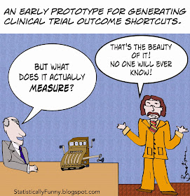
The biggest worry, though, is when researchers play the slot machine in my cartoon (what we call the pokies, "Downunder"). I've stressed the dangers of hunting over and over for a statistical association (here and here). The analysis by Lim and colleagues found some suggestion that component outcomes are sometimes selected to rig the outcome. If it wasn't the pre-specified primary outcome, and it wasn't specified in the original entry for it in a trials register, that's a worry. Then it wasn't really a tested hypothesis - it's a new hypothesis.

Composite endpoints, properly constructed, reported, and interpreted are essential to getting us decent answers to many questions about treatments. Combining death with serious non-fatal events makes it clear when there's a drop in an outcome largely because people died before that could happen, for example. But you have to be very careful once so much is compacted into one little data blob.


 (Check out slide 14 to see the forest plot of results for the individual components the journalist was reporting on. Forest plots are explained here at Statistically Funny.)


More on understanding clinical trial outcomes:


New this week: I'm delighted to now have a third blog, one for physicians with the wonderful team at MedPage Today. It's called Third Opinion.