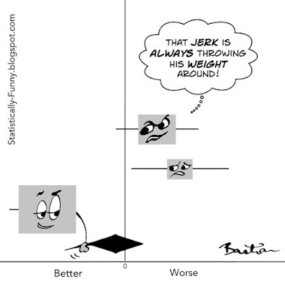
On the plus side, this jerk explains a lot about the data in a meta-analysis!
This cartoon is a forest plot, a style of data visualization for meta-analysis results. Some people call them "blobbograms". Each of these horizontal lines with a square in the middle represents the results of a different study. The length of that horizontal line represents the length of the confidence interval (CI). That gives you an estimate of how much uncertainty there is around that result - the shorter it is, the more confident we can be about the result. (Statistically Funny explainer here.)
The square is called the point estimate - the study's "result" if you like. Often, it's sized according to how much weight the study has in the meta-analysis. The bigger it is, the more confident we can be about the result.
The size of the point estimate is echoing the length of the confidence interval. They are two perspectives on the same information. Small square and long line provides less confidence than a big square with a short line.

The diamond here is called the summary estimate. It represents the summary of the results from the 3 studies combined. It doesn't just add up the 3 results then divide them by 3. It's a weighted average. Bigger studies with more events count for more. (More on that later.)
The left and right tips of the diamond are the two ends of the confidence interval. With each study that gets added to the plot, those tips will get closer together, and it will move left or right if a study's result tips the scales in one direction.
The vertical line in the center is the "line of no effect". If a result touches or crosses it, then the result is not statistically significant. (That's a tricky concept: my explainer here.)
In biomedicine, forest plots are the norm. But in other fields, like psychology, the results of meta-analyses are often presented as tables of data. That means that each data point - the start and end of each confidence interval, and so on - are numbers in a column instead of plotted on a graph. (Here's a study that does that.)
So what about that jerk? He carries so much weight not just because the study has a lot of participants in it. What's called a study's precision depends on the number of "events" in the study, too.
Say the event you’re interested in is heart attacks – and you are investigating a method for reducing them. But for whatever reason, not a single person in the experimental or control group has a heart attack even though the study was big enough for you to have expected several. That study would have less ability to detect any difference your method could have made, so the study would have less weight.
It's very common for a study, or a couple of them, to carry most of the weight in a meta-analysis. A study by Paul Glasziou and colleagues found that the trial with the most precision carried an average of 51% of the whole result. When that's the case, you really want to understand that study.
Some studies are such whoppers that they overpower all other studies – no matter how many of them there are. They may never be challenged, just because of their sheer size: No one might ever do a study that large on the same question again.
The size of the point estimate and length of the line around it are clues to the weight of the study. The meta-analysis might also include the percentages of weight for each study.
Like to know more? This is a shorter version of one of the tips in my post at Absolutely Maybe, 5 Tips for Understanding Data in Meta-Analyses. Check it out for a more in-depth example of looking at the weight of a study and 4 more key tips!
Hilda
